
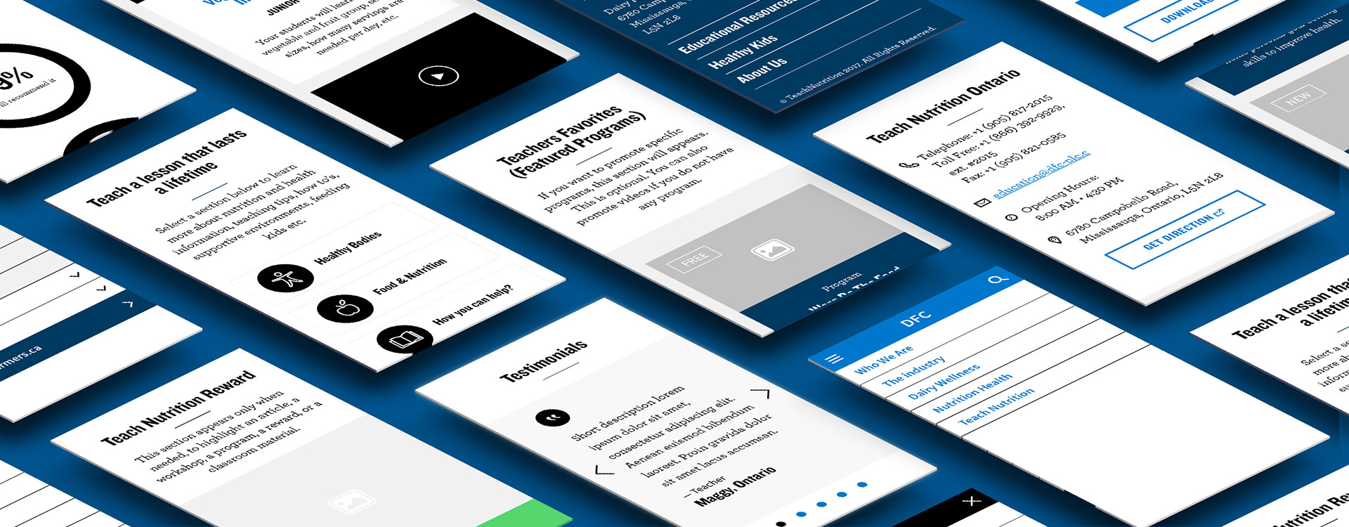
Teach Nutrition is a platform powered by Dieticians for Teachers and Educators, ran by Dairy Farmers of Canada. I took the project at its initial stage. It gave me the opportunity to develop some mobile wireframes for the first time.
I worked from pre-approved desktop wireframes created by a third-party company our client previously partnered with. Sadly, this project has not been thought as a mobile-first experience. Desktop screens have been created prior to the mobile ones, and user interactions were too complex to work on mobile. Therefore, my challenge relied on simplifying them dramatically.
Need more context? Enjoy reading the UX Solutions further down below
№ 1
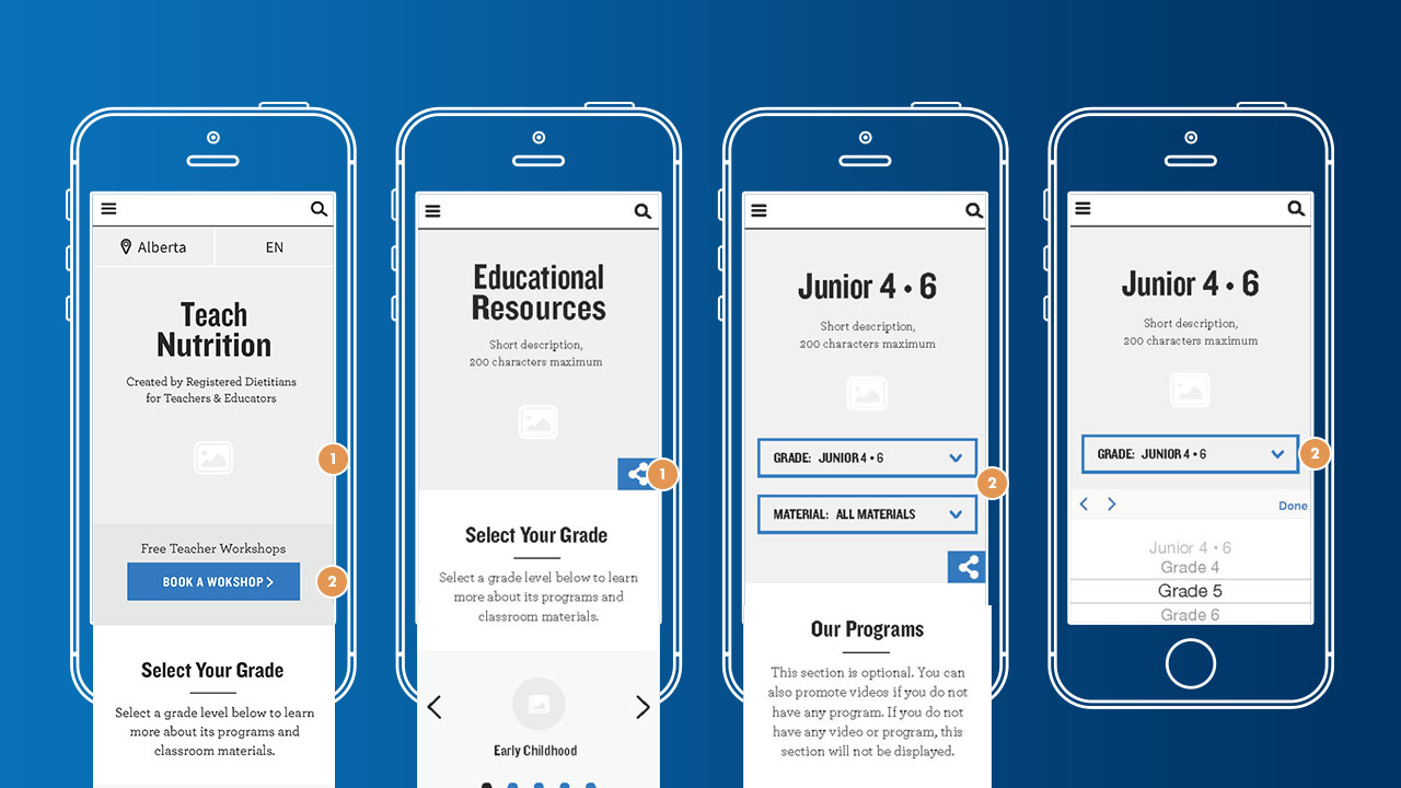
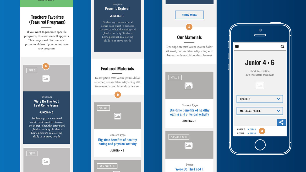
I came-up with user-centred solutions for the way the user will interact with drop-down lists. We'll have them selecting items from a new mobile screen with a close button. It will prevent them from scrolling while keeping the dropdown open. However, as it cost more to produce, developers decided to go for native iOS & Android selection pickers.
№ 2
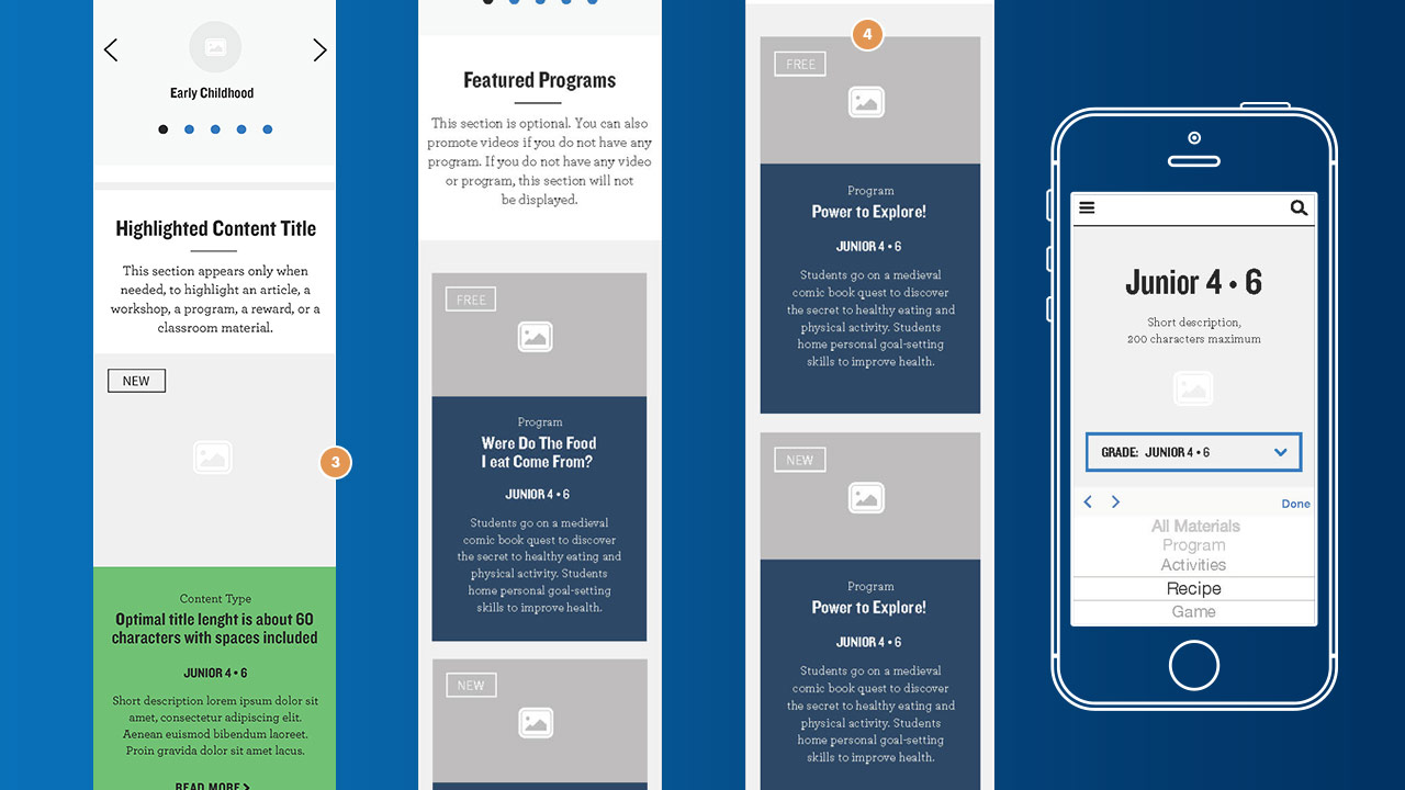
On a specific desktop card, users could read more content on rollover, plus directly buy or download the program. Since there is no rollover state on mobile, and since the whole card cannot have three actions associated with it, we'll direct the user to a 'Details' page, from which users will be able to get more insight, 'Order' or 'Download' the educative material.
№ 3
I've also refined the user-experience for mobile, by adapting the desktop 1st/2nd level navigation and footer's links.
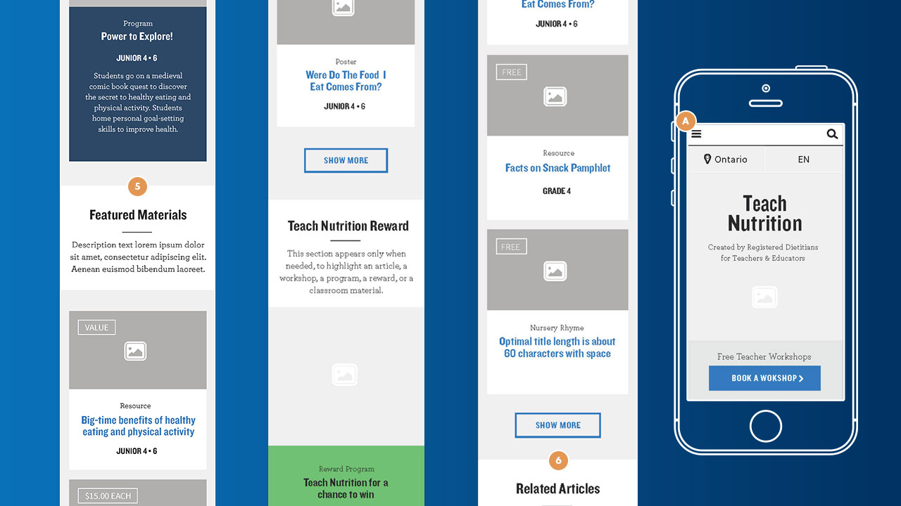
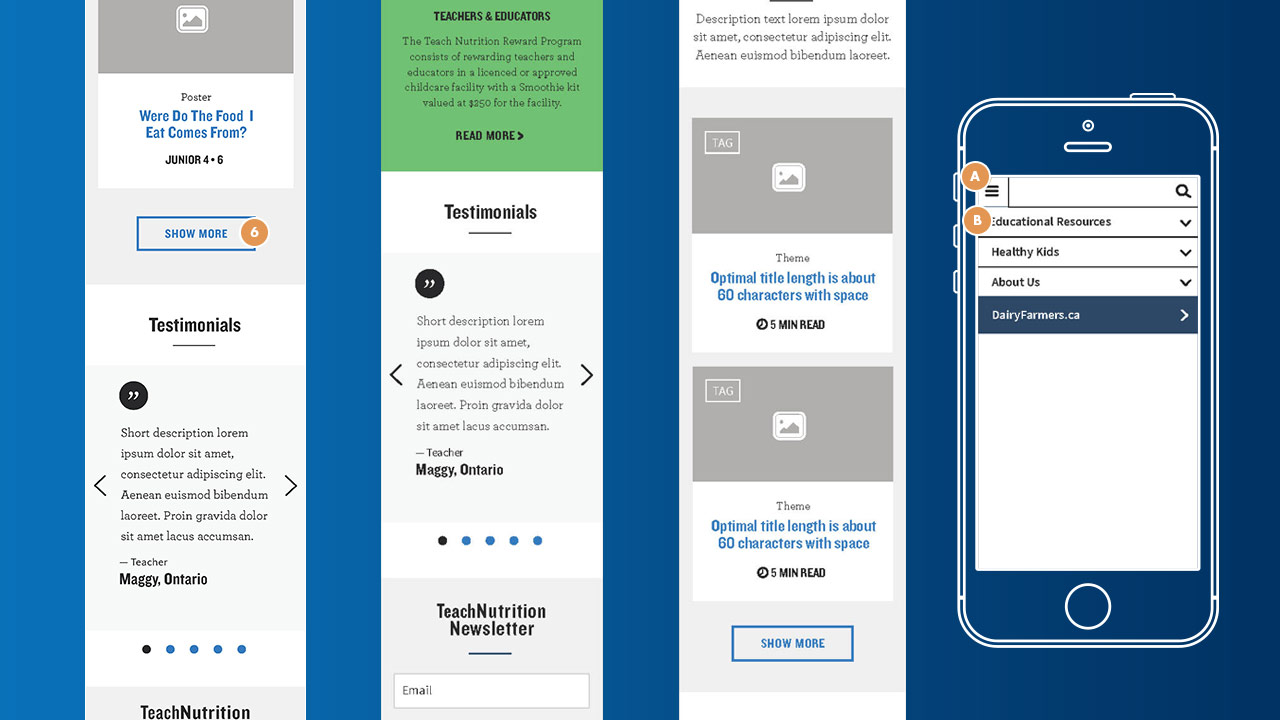
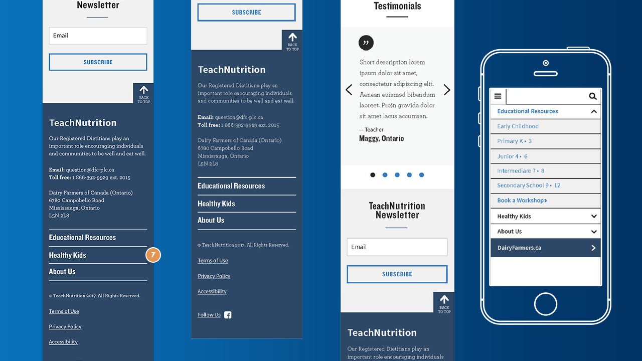
In terms of UI design:
Since the web style guide was already established, I decided to inject some styles into the wireframes to make them a bit closer to their final state. I've kept the result pretty dull, as my task was not to design but think about users interactions. I've used visual cues to distinguish key functionalities from least important ones.