
Le Manifeste Français provides expert insights on French fashion, beauty secrets and good manners as an art form, for those who want to improve their image. They approached me to create their visual identity and brand guidelines.
'Le Manifeste Français' logo is a powerful monogram (M + F) that evokes the Eiffel Tower and perfectly aligns with the company mission. Find out why below.
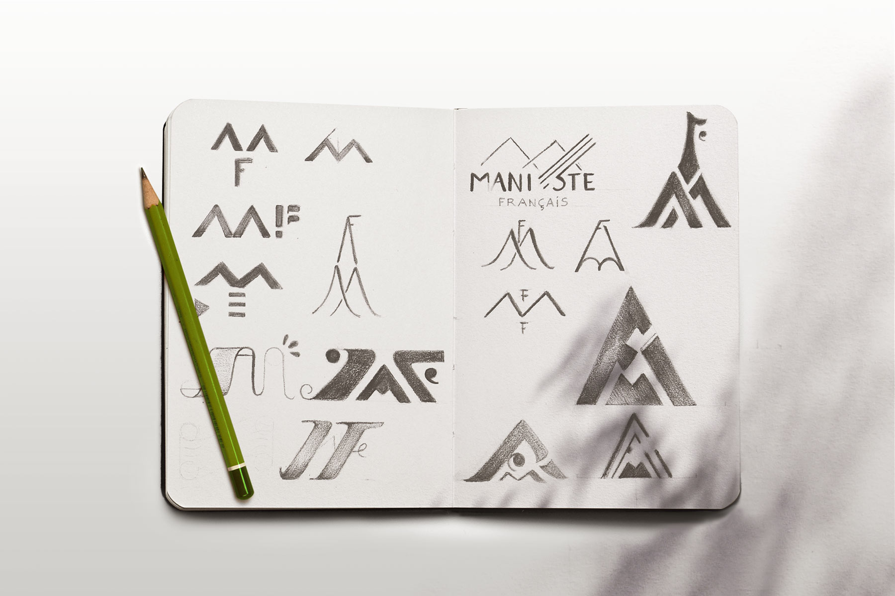
№ 1/ Monogram/Symbol Composition
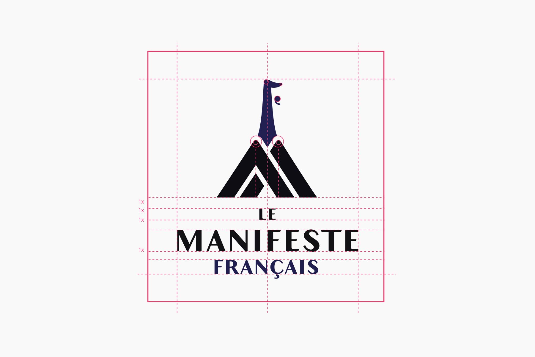
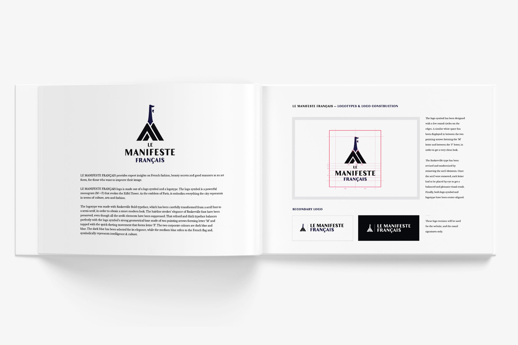
The MF monogram evokes the iconic Eiffel Tower. As the emblem of Paris, it embodies everything the city represents in terms of culture, arts, and fashion. The masculine 'M' contrasts with a more feminine 'F', as a nod to their male and female target audiences. The idea of 'Manifesto' is then expressed via a bold pyramidal composition.
№ 2/ Typography
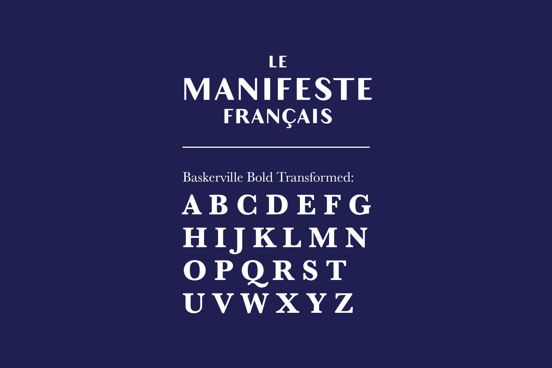
Le Manifeste Français' wordmark is made with a transformed Baskerville Bold typeface to obtain a more modern look.
№ 3/ Colour
A rich black is paired with the French flag' sapphire blue, also used as a symbol of intelligence & culture.
When a website redesign leads to the in-house revamp of a 5-year old visual language, you dictate new design rules and turn into a deck designer. Compare the old and new guidelines below.
I've been involved in helping out some small Canadian businesses & Ontario based French organizations by creating their visual identities.


“I have worked with Agnes professionally for many years and have to say that she is one of the most talented Art Directors/Designers I’ve worked with. Her passion for creative extends beyond graphic design and that truly comes through in her work. She’s hard-working, easy to work with and can completely understand and translate your vision onto “pen and paper” or the digital screen. Recently I was blown away and surprised by her creation of a hand drawn and concepted logo she created for one of my projects - you don’t get this level of dedication or talent with any designer out there.”