
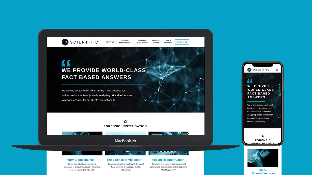
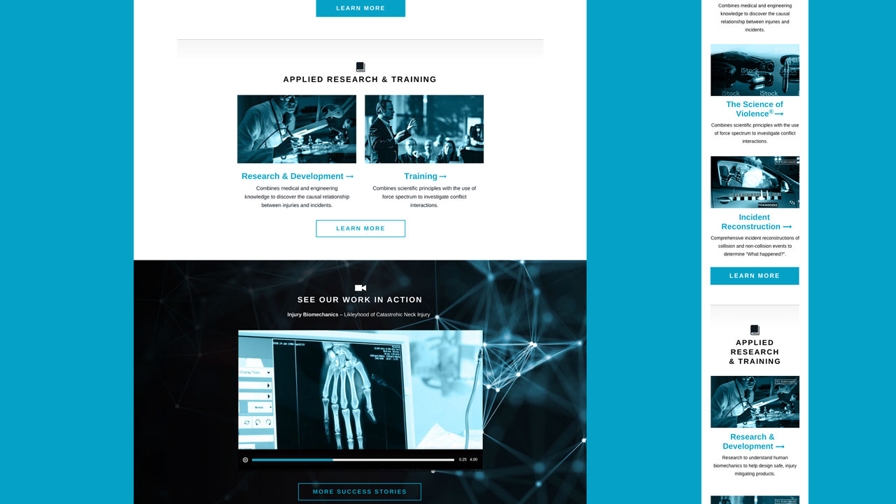
GTD Scientific is a forensics technology company headquatered in Vancouver. They approached us to redesign their website in a responsive way, and create branded materials.
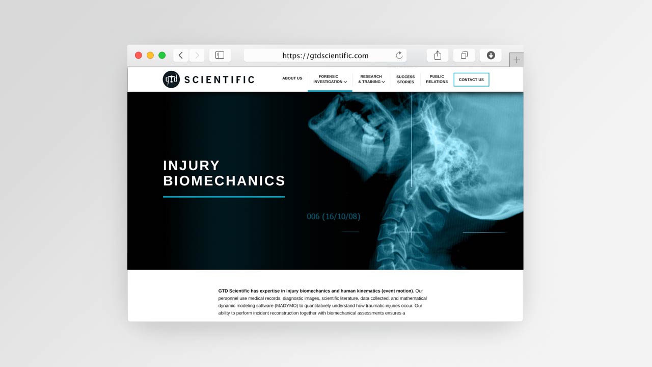
A 'Medical & X-Ray Feel' Design Theme:
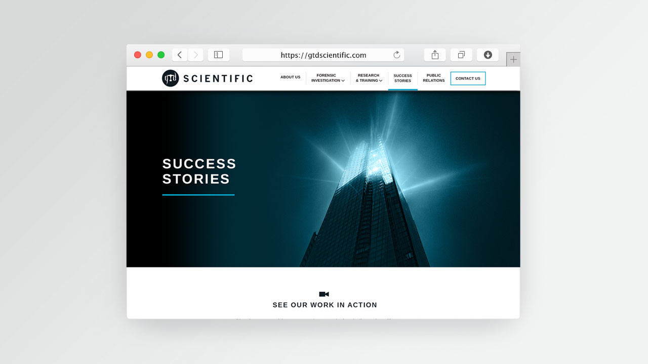
The dark duotone image treatment conveys a somber scientific mood. It fits the company's mission which focuses on determining which factors lead to violent physical accidents. The blue accent colour symbolises science and technology — while the black tones and bold imagery serve the business' dark science.
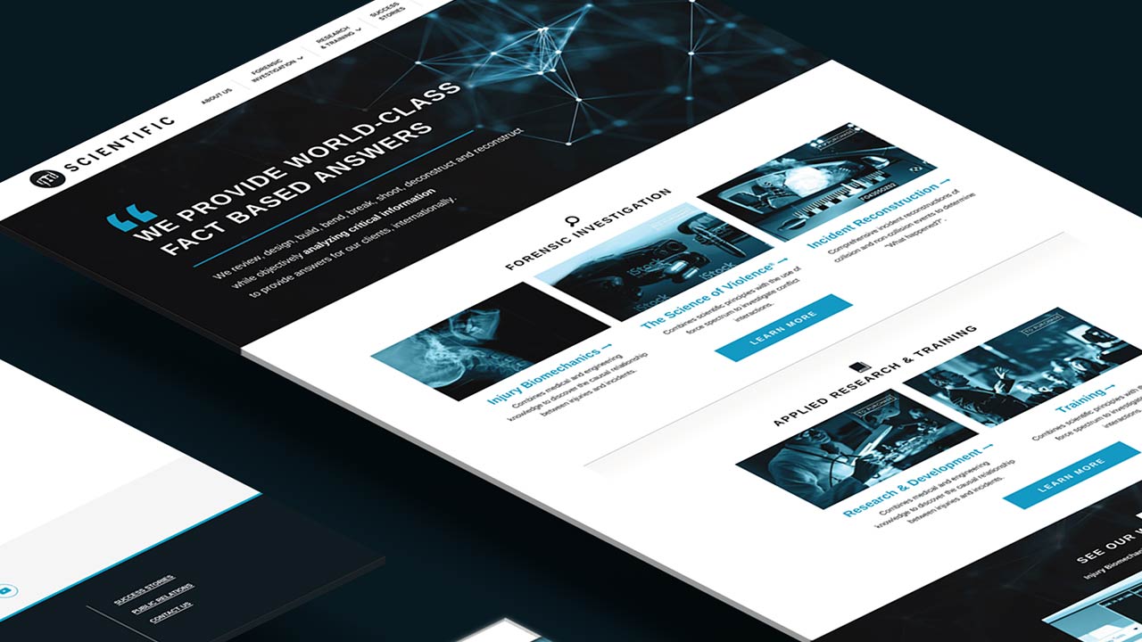
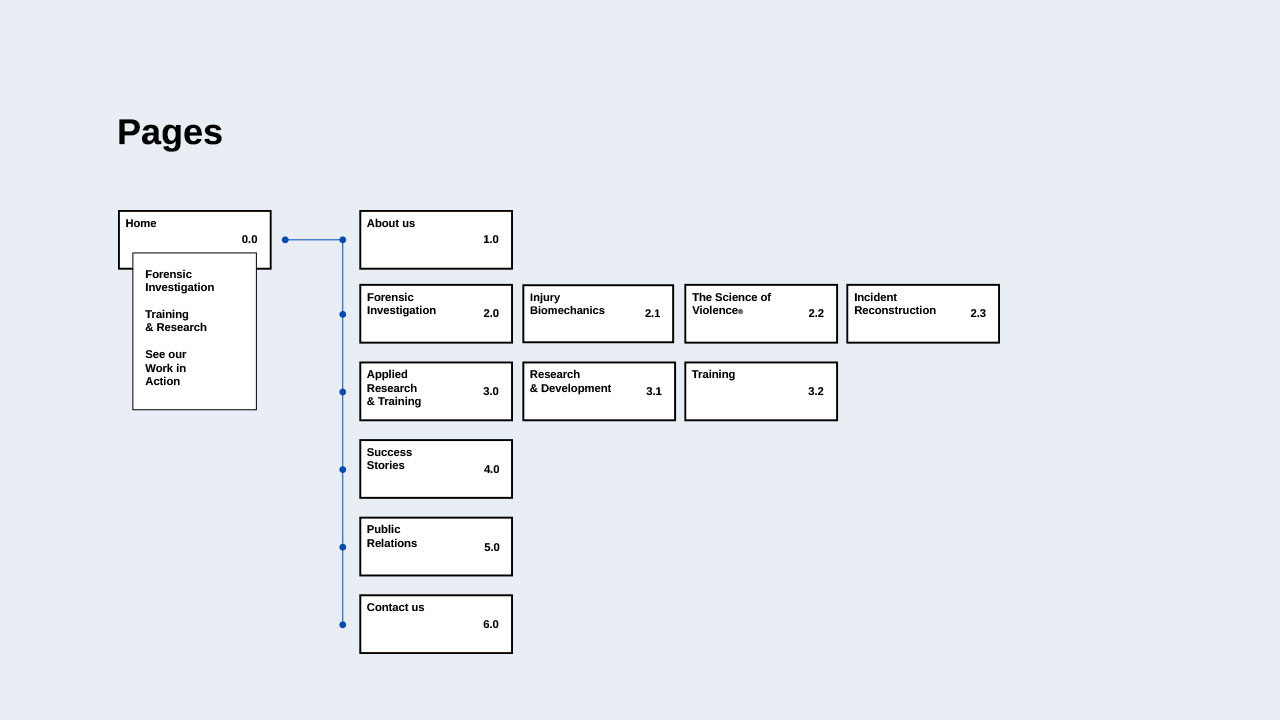
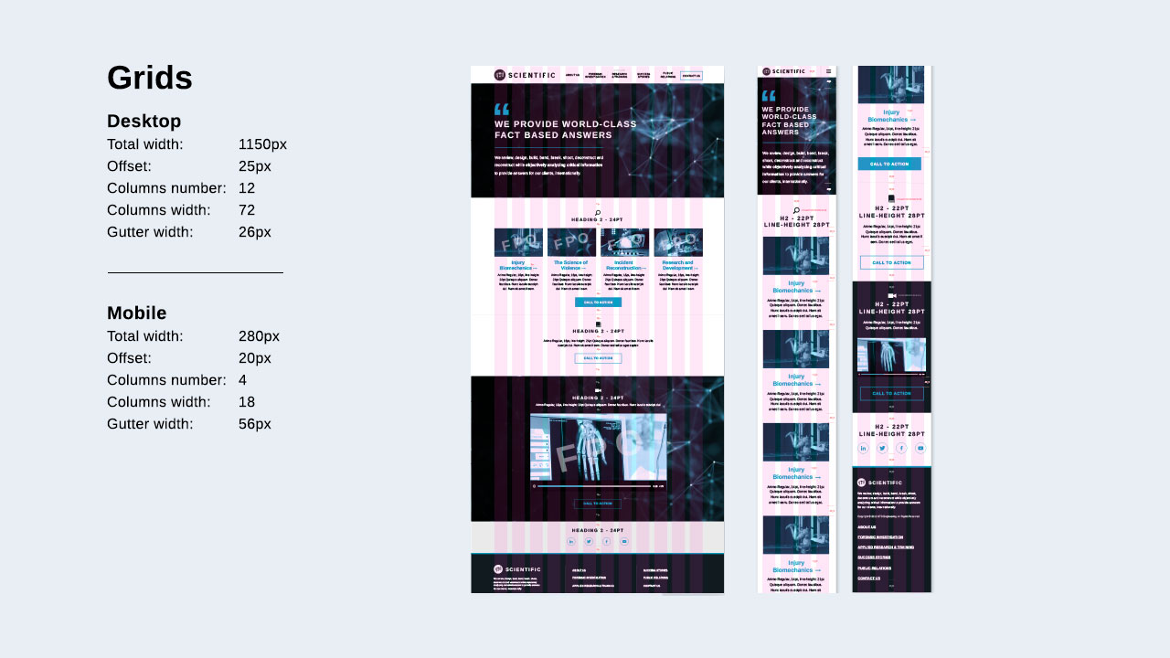
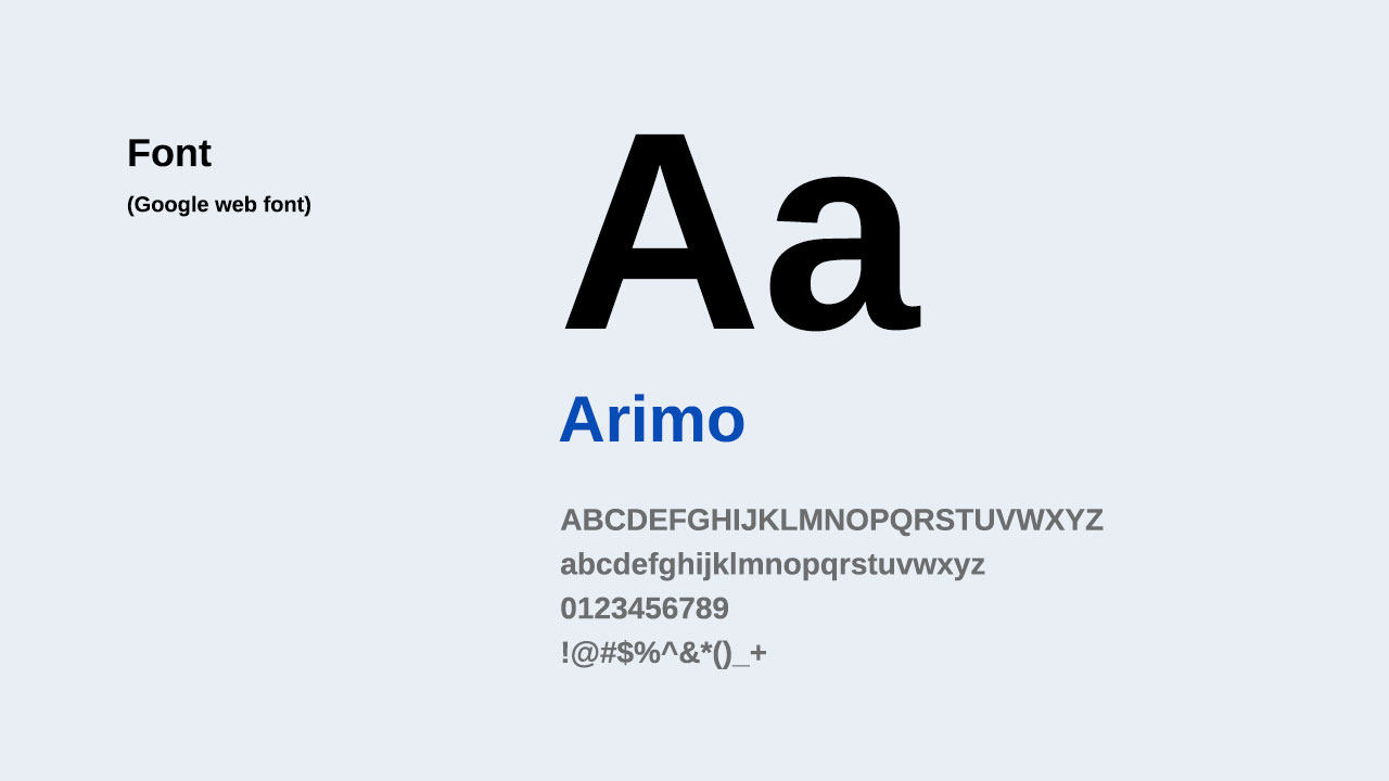
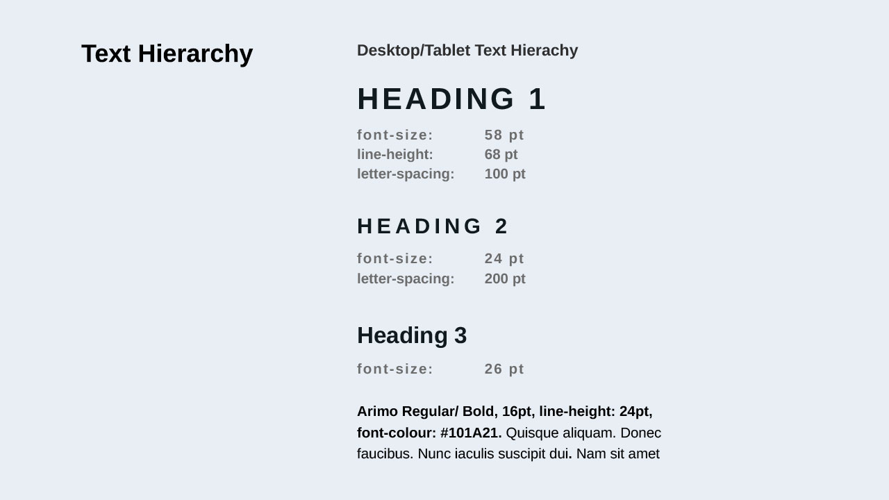
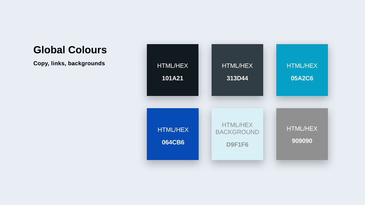
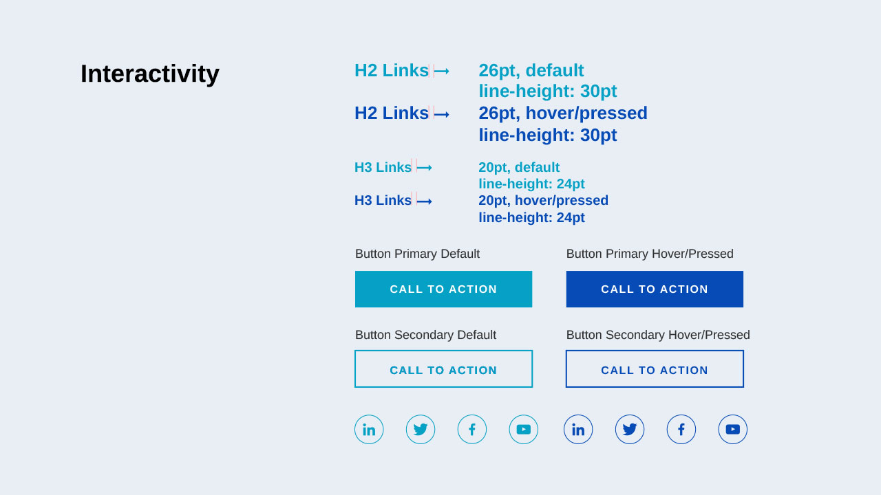
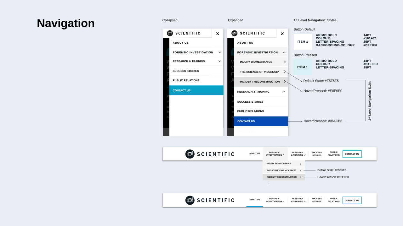
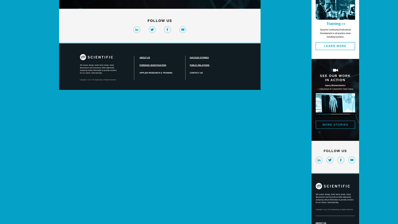
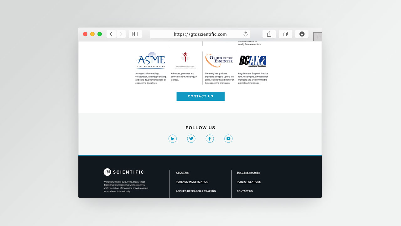
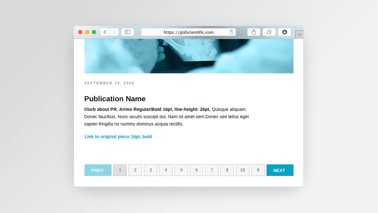
I've defined the information architecture (1st & 2nd level navigation), the web grids and all the interaction states. I then created the website visual ID, the web style guide and layouts showcased below.
I've made some buisness cards, a both-sided rack card, a thank you card, a tear drop, a retractable banner and prepared brand assets for paper bags.
"Jeff has been really pleased with the result that he judged very professional."